Posts

Final Portfolio

Image
  For my theme I decided to do all pinks throughout the whole thing. I did different shades of pinks in the squares that I added on every page, and I stayed with the same background pink so it looked good altogether. As for the font I decided to do different ones on each page so it was something different to see and I decided to make all the lettering in white because it looked the best on top of the pinks. Overall, I had a Wonderfull time doing to final project. It was defiantly very time consuming but at the end of the day It made me realize how much we actually got done in this class and I'm excited to show everyone all my projects I did, now that they are in one spot it makes it a lot easier for us all.

Business Cards

Image
For my business cards I wanted to make it so it really stood out. I did this by adding a bunch of different colors and adding them together. I used bright colors and decided to make a bunch of shapes to make it look very abstract. I love how it turned out with my logo. I specially love my last business card because the shape theme went with the shape of my logo. For my first business card I decided to make the color yellow the main theme and that's what gave me the idea to do a big bright yell sun. I love this idea because it looks really happy, like my design shows. Finally I really like how all 3 of them are really different from each other because I wanted to make each on its own message and theme so I am proud with how it turned out.  

Indesign

  https://www.youtube.com/watch?v=AshfNo-i8Ws   After watching this video I realized how similar this is to photoshop. I think it will be easy to figure out each different tool because they are all similar. In this video they showed us all the basic tools including the move tool, making shapes, and filling objects in with color. All of these we had experience with in photoshop adobe. They also have a tool that bends the angles of different shapes. Overall, I think this will be a easy one to learn about because its the last one and we have a lot of experience with the different tools now. https://www.youtube.com/watch?v=0eqhUFRlvgI  After watching this video I am now so excited to start with it! People use this app to create invitation, and even flyers. I used to love to make these for when I had party and events, this was my favorite thing to do for them. After knowing this I hope this is the what we end up doing with this app. I also learned that the format is different,...

Autoscopy

Image
For my autos-copy I decided to take it into a different route. I taught my self how to make this glitch effect and I love it so much. It was so cool to do and I really like how it turned out with all the different colors. To start this I put my photo into black and white, then I turned of one of the RGB's on a different layer, each separately. Doing this brings out different colors that were in my picture originally, before I put it in black and white. After I finished that part I thought it needed something more. I decided to look up different tutorials and I found this neon light one. I drew a triangle and switch up all different kinds of settings to make It look like it was glowing around me. Then, I decided to add a bright purple butterfly in and make it look like it was through the window glass. Finally I added my logo in the upper left corner and lower left corner in the same neon color I used for the triangle. I am so happy with this product and im excited to be able to do i...

Somewhere

Image
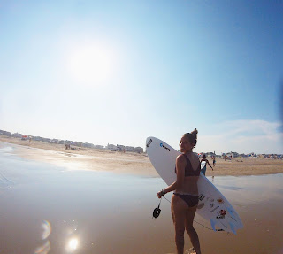
  I decided to crop my self into my favorite movie Soul Surfer. This is one of my favorite movies and the scene I used is my favorite scene. I thought this was a perfect picture to use because I had a picture of me with my surfboard. Soul surfer is about surfing so I really wanted to make it look real. It was hard to make my legs look normal but I accomplished this by adding more of the ocean onto of my legs to make it look like my feet were under the water. Other than that, I did have some trouble with the lighting with the picture is really bright but the picture I inserted of me was very dark.

Photoshop homework 2

Image
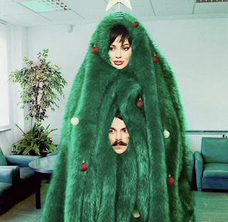
  This picture I got off Kirby Jenners instagram account. I picked this photo because I believe out of all the photos I saw this would been the hardest one to photoshop my self in. I think this because it looks the less realistic out of all of them on his instagram. What I mean by this, I think it was hard for him to do because of the big green blanket that is around her head. There is no other opening so he had to make one himself by adding a picture of his head. I think If I were to add my self in it wouldn't be as difficult but wouldn't look good. One part that would be difficult would be the blending of the green fur blanket to the outlines of my face.                                                                      This im...

BW to color

Image
This is the original image of me and my friend at the beach. I decided to make the ocean a pretty pink color to really make it stand out. Part of this was difficult like the parts of the ocean that appears in-between our arms. To complete this successfully I used the paint brush tool to touch it up. I also use the hue tool to make the color blend in more so it wasn't so bright. For this one I wanted to make it look like there was a sunset in the sky and I loved how it turned out. I really like this one because its very simple and looks very real. I also added my logo in the top left.                                                                                                      ...

Tag Brush- Roselli

Image
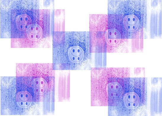
       My tag brush that is shown above contains the logo I made in Illustrator. The reason I made this logo is because it is a good representation of myself and a lot of other people in the world. It shows a smiley face with a sad face at the same time. I wanted to create this to reflect on both the happy and sad emotions in a person. To create the tag brush we started with making an outline of our logo so nothing would completely hide it. Then I added the spray paint affect and lastly the scratches. I think these looks and effects went so well with my logo, I am so happy with how it turned out. Finally, I printed 4 more on my paper. I did this because I thought it looked too plain with only a couple so I wanted to make a figuration out of it. As for the color I picked pink and blue to represent both boy and a girl. I liked this idea because it shows how we all have the same emotions inside.

photoshop

https://www.youtube.com/watch?v=61mkx_OV61s  After watching and following along to this YouTube video about adobe photoshop I learned a lot. One thing that I really like that I think will be easy and quick is how you import your picture. In this video it is shown that you can drag and import a photo that's on your desktop. I like this because its quick and easy. Another tool that I think will be easy and fun to use is the adjustment feature, this is where you can turn your photo until different shapes and adjust it however you may like. https://www.youtube.com/watch?v=pFyOznL9UvA  After watching this video something that showed that I think will be hard to use is the layer icon, though we used this in illustrator I think it's gonna be more difficult for photoshop. I think this because in photo shop you're using so many different layers because you're adding so many different things so I think it might get confusing editing each one. A tool that I think will be easy to u...

Propaganda poster project

Image
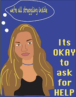
  For my propaganda poster I decided to do it on mental health. I did this because I know a lot of people that have mental issues including myself. Mental health can be a very small problem but can turn into bigger problems, which is why I wanted to bring awareness to it. To the left of my poster I wrote "its okay to ask for help" and in the top left I wrote "we're all struggling inside". These are to saying that stand for mental health. With the saying "Its okay to ask for help" is letting people know that there are people out there that want to help you. As for the other saying It lets the viewers know that they are not alone.

My Logo

Image
My logo represents the happiness and sadness that life brings. Sometimes everything is going so well and your so happy, but there's always that one little thing that makes you sad. This is why I love my logo because it represents both good and bad times. As for the colors I decided to do the yellow and black one because I think its a very classic look and has both dark and sad and bright and happy colors in it. As for the yellow fading into the orange colored one, I did this because it reminded me of the times I would watch the sunset. I would do this at home with my friends right before we all left each other for college. It represented a sad time but the sunset made it better. Finally, the black and hot pink one was inspired by the brightness the pink has in it, I really love how it looks against the black.

What is the internet?

 The internet is a network that connects all computers around the whole world. The internet allows people to communicate through many ways including email, texts, phone calls, and more. You can share information and communicate with people anywhere, as long as you have an internet connection. The internet moves information and data from one place to another, this allows us to do all the things we are able to do today all because of Bob Kahn and Vint Cerf, the inventors of the internet. On October 29th, 1969, the first message was delivered from one computer to another. This shortly became the "networks to networks" that is now modern internet.  The World Wide Web is an "interconnected system of public webpages accessible through the internet". The Web and the Internet are not the same, they are different because the Web was actually built on top of the internet. The World Wide Web also works very differently, it is a systems of interlinked, hypertext documents which...

#0 blog

Image
   Hi, My name is Olivia Roselli and I am a freshman at the university of Tampa. I am from Pennsylvania, 45 minutes outside of Philly. I have three brothers, 2 dogs and a fish. Some of my favorite hobbies include surfing in the summer, hanging out with my friends, and listening to music in the car. Some of my accomplishments include going through surgery and recovering strong after them. Some of my fails include not making a certain sports team in High school. One fun fact about me is that I am a very organized person, maybe sometimes ocd. Other than that I am really excited to learn more about this class and gain skills to show my family. My brother majored in computer science so I am excited to put my self into his shoes and see what he's been working with. Digital media seems very interesting to me because not a lot of people are majored in it. Though it can be hard I am willing to work through it and become smarter with these different tools that we will be using. 

Letter to my future self. blog post

Image
 Letter to my future self I wrote about my family, friends and how I thought I would be 20 years from now. I made a dog out of a picture I found The the reason I made a dog is because It symbolizes family, friends, and my happiness. I really am happy with how this turned out and the story line that goes along with it. The reason I did the color brown/yellow is because its the color of my dog that passed away. Finally, even thought the dog shape isn't perfect after awhile I realized I liked it this way because its okay if my future isn't perfect. 

illustrator tools blog post.

1-How To Use The Basic Tools in Adobe Illustrator https://m.youtube.com/watch?v=UqjZR_v37K8   After watching this video I think the easiest tool to use will be the zoom feature and the hand feature. I think these are both very convenient ways to go about what your making. I like how where ever you point you mouse, is where your art moves, it seems a lot easier then how we had it before. However, I think the hardest tool to use for me would be the process of duplicating the papers. In the video they explain how you need to be holding down all 3 buttons at the same time to duplicate your water. I think after some time I’ll be able to get this down but it seems like a tricky process. 2-Getting Started with Adobe Illustrator for Beginners Tutorial https://m.youtube.com/watch?v=AinkCNooh2A In this video I found it very interesting how you can crop the paper on the computer. I like this because if you want a smaller price for your art board you can make the page smaller or bigger if your...