Posts

Showing posts from November, 2021

Autoscopy

Image
For my autos-copy I decided to take it into a different route. I taught my self how to make this glitch effect and I love it so much. It was so cool to do and I really like how it turned out with all the different colors. To start this I put my photo into black and white, then I turned of one of the RGB's on a different layer, each separately. Doing this brings out different colors that were in my picture originally, before I put it in black and white. After I finished that part I thought it needed something more. I decided to look up different tutorials and I found this neon light one. I drew a triangle and switch up all different kinds of settings to make It look like it was glowing around me. Then, I decided to add a bright purple butterfly in and make it look like it was through the window glass. Finally I added my logo in the upper left corner and lower left corner in the same neon color I used for the triangle. I am so happy with this product and im excited to be able to do i

Somewhere

Image
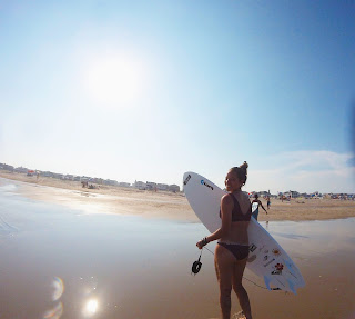
  I decided to crop my self into my favorite movie Soul Surfer. This is one of my favorite movies and the scene I used is my favorite scene. I thought this was a perfect picture to use because I had a picture of me with my surfboard. Soul surfer is about surfing so I really wanted to make it look real. It was hard to make my legs look normal but I accomplished this by adding more of the ocean onto of my legs to make it look like my feet were under the water. Other than that, I did have some trouble with the lighting with the picture is really bright but the picture I inserted of me was very dark.

Photoshop homework 2

Image
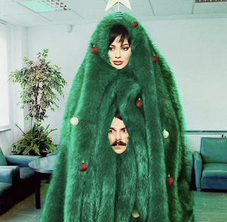
  This picture I got off Kirby Jenners instagram account. I picked this photo because I believe out of all the photos I saw this would been the hardest one to photoshop my self in. I think this because it looks the less realistic out of all of them on his instagram. What I mean by this, I think it was hard for him to do because of the big green blanket that is around her head. There is no other opening so he had to make one himself by adding a picture of his head. I think If I were to add my self in it wouldn't be as difficult but wouldn't look good. One part that would be difficult would be the blending of the green fur blanket to the outlines of my face.                                                                      This image inspired me the most for what I want to do for my project because it looks so real, the most real one I saw. It shows that you don't have to add yourself in a boring movie scene for it to look "real". This picture shows so many diffe

BW to color

Image
This is the original image of me and my friend at the beach. I decided to make the ocean a pretty pink color to really make it stand out. Part of this was difficult like the parts of the ocean that appears in-between our arms. To complete this successfully I used the paint brush tool to touch it up. I also use the hue tool to make the color blend in more so it wasn't so bright. For this one I wanted to make it look like there was a sunset in the sky and I loved how it turned out. I really like this one because its very simple and looks very real. I also added my logo in the top left.                                                                                                                                                  Back and white version   For this image I decide to make a different look by making both our hair purple and my friends legs purple. I was inspired to do this from the picture I found online I think it brings a funny look to it. I made the whole background gre

Tag Brush- Roselli

Image
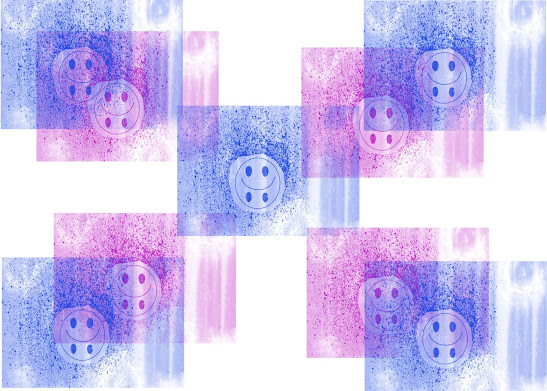
       My tag brush that is shown above contains the logo I made in Illustrator. The reason I made this logo is because it is a good representation of myself and a lot of other people in the world. It shows a smiley face with a sad face at the same time. I wanted to create this to reflect on both the happy and sad emotions in a person. To create the tag brush we started with making an outline of our logo so nothing would completely hide it. Then I added the spray paint affect and lastly the scratches. I think these looks and effects went so well with my logo, I am so happy with how it turned out. Finally, I printed 4 more on my paper. I did this because I thought it looked too plain with only a couple so I wanted to make a figuration out of it. As for the color I picked pink and blue to represent both boy and a girl. I liked this idea because it shows how we all have the same emotions inside.

photoshop

https://www.youtube.com/watch?v=61mkx_OV61s  After watching and following along to this YouTube video about adobe photoshop I learned a lot. One thing that I really like that I think will be easy and quick is how you import your picture. In this video it is shown that you can drag and import a photo that's on your desktop. I like this because its quick and easy. Another tool that I think will be easy and fun to use is the adjustment feature, this is where you can turn your photo until different shapes and adjust it however you may like. https://www.youtube.com/watch?v=pFyOznL9UvA  After watching this video something that showed that I think will be hard to use is the layer icon, though we used this in illustrator I think it's gonna be more difficult for photoshop. I think this because in photo shop you're using so many different layers because you're adding so many different things so I think it might get confusing editing each one. A tool that I think will be easy to u