Posts

Final Portfolio

Image
  For my theme I decided to do all pinks throughout the whole thing. I did different shades of pinks in the squares that I added on every page, and I stayed with the same background pink so it looked good altogether. As for the font I decided to do different ones on each page so it was something different to see and I decided to make all the lettering in white because it looked the best on top of the pinks. Overall, I had a Wonderfull time doing to final project. It was defiantly very time consuming but at the end of the day It made me realize how much we actually got done in this class and I'm excited to show everyone all my projects I did, now that they are in one spot it makes it a lot easier for us all.

Business Cards

Image
For my business cards I wanted to make it so it really stood out. I did this by adding a bunch of different colors and adding them together. I used bright colors and decided to make a bunch of shapes to make it look very abstract. I love how it turned out with my logo. I specially love my last business card because the shape theme went with the shape of my logo. For my first business card I decided to make the color yellow the main theme and that's what gave me the idea to do a big bright yell sun. I love this idea because it looks really happy, like my design shows. Finally I really like how all 3 of them are really different from each other because I wanted to make each on its own message and theme so I am proud with how it turned out.  

Indesign

  https://www.youtube.com/watch?v=AshfNo-i8Ws   After watching this video I realized how similar this is to photoshop. I think it will be easy to figure out each different tool because they are all similar. In this video they showed us all the basic tools including the move tool, making shapes, and filling objects in with color. All of these we had experience with in photoshop adobe. They also have a tool that bends the angles of different shapes. Overall, I think this will be a easy one to learn about because its the last one and we have a lot of experience with the different tools now. https://www.youtube.com/watch?v=0eqhUFRlvgI  After watching this video I am now so excited to start with it! People use this app to create invitation, and even flyers. I used to love to make these for when I had party and events, this was my favorite thing to do for them. After knowing this I hope this is the what we end up doing with this app. I also learned that the format is different,...

Autoscopy

Image
For my autos-copy I decided to take it into a different route. I taught my self how to make this glitch effect and I love it so much. It was so cool to do and I really like how it turned out with all the different colors. To start this I put my photo into black and white, then I turned of one of the RGB's on a different layer, each separately. Doing this brings out different colors that were in my picture originally, before I put it in black and white. After I finished that part I thought it needed something more. I decided to look up different tutorials and I found this neon light one. I drew a triangle and switch up all different kinds of settings to make It look like it was glowing around me. Then, I decided to add a bright purple butterfly in and make it look like it was through the window glass. Finally I added my logo in the upper left corner and lower left corner in the same neon color I used for the triangle. I am so happy with this product and im excited to be able to do i...

Somewhere

Image
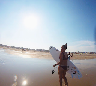
  I decided to crop my self into my favorite movie Soul Surfer. This is one of my favorite movies and the scene I used is my favorite scene. I thought this was a perfect picture to use because I had a picture of me with my surfboard. Soul surfer is about surfing so I really wanted to make it look real. It was hard to make my legs look normal but I accomplished this by adding more of the ocean onto of my legs to make it look like my feet were under the water. Other than that, I did have some trouble with the lighting with the picture is really bright but the picture I inserted of me was very dark.

Photoshop homework 2

Image
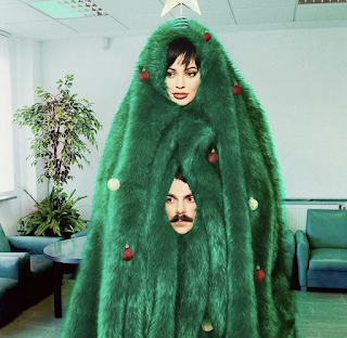
  This picture I got off Kirby Jenners instagram account. I picked this photo because I believe out of all the photos I saw this would been the hardest one to photoshop my self in. I think this because it looks the less realistic out of all of them on his instagram. What I mean by this, I think it was hard for him to do because of the big green blanket that is around her head. There is no other opening so he had to make one himself by adding a picture of his head. I think If I were to add my self in it wouldn't be as difficult but wouldn't look good. One part that would be difficult would be the blending of the green fur blanket to the outlines of my face.                                                                      This im...

BW to color

Image
This is the original image of me and my friend at the beach. I decided to make the ocean a pretty pink color to really make it stand out. Part of this was difficult like the parts of the ocean that appears in-between our arms. To complete this successfully I used the paint brush tool to touch it up. I also use the hue tool to make the color blend in more so it wasn't so bright. For this one I wanted to make it look like there was a sunset in the sky and I loved how it turned out. I really like this one because its very simple and looks very real. I also added my logo in the top left.                                                                                                      ...